
A manuscript can be brilliant and still arrive in the world looking anonymous. That is the uncomfortable gap between finishing a book and building a readership: the text may be distinctive, while the cover, author image, sales copy, social posts, and event materials look as if they came from five unrelated projects.
For Polish writers and small presses, visual branding is not a luxury borrowed from consumer goods. It is a practical way to make a book legible in a crowded market, especially when the publisher cannot buy permanent visibility in large chains or sustain a long advertising campaign.
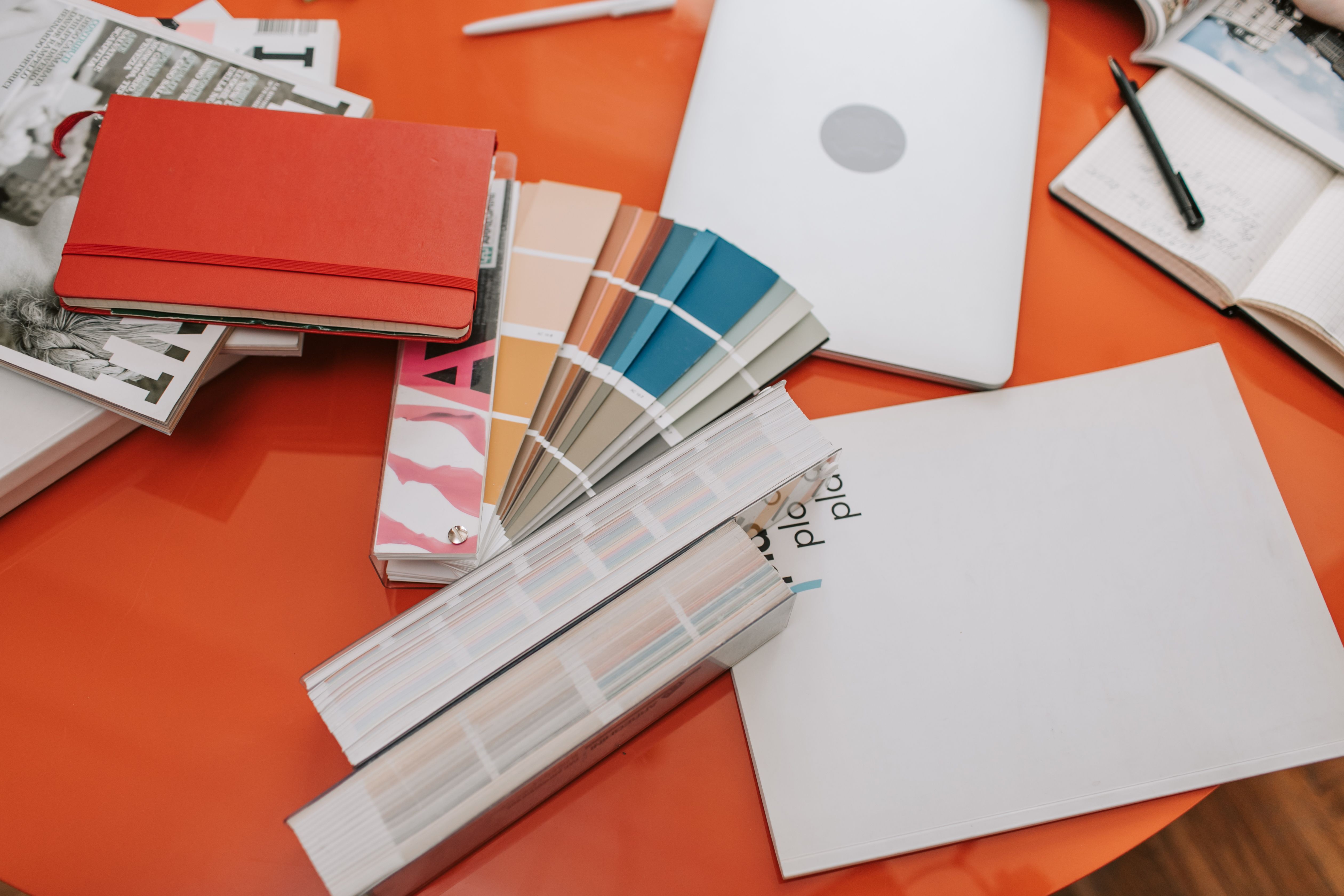
The Polish book market makes recognition unusually valuable
The Polish Book Market 2025 report, prepared by the Polish Book Institute using data from Biblioteka Analiz, Nielsen IQ Book Data, and the National Library, describes a market in which more than half of books are sold online and discounting is a major promotional mechanism. That changes how a reader encounters a title: often as a small thumbnail, a cropped social post, a search result, or a row of similar spines.
A small press cannot control every point of sale. It can control whether the same book is recognizable at each point. The cover should survive a phone screen. The author name should remain readable in a newsletter. A quote card should feel like part of the same publication rather than an improvised graphic made ten minutes before posting.
This is the first principle: brand consistency is a visibility strategy, not decoration. It reduces the mental effort required to remember a title, an author, or an imprint.
Start with the book’s promise, not a colour trend
Before choosing a palette, write one sentence that describes the reader’s expected experience. Not the plot summary. A promise might be “quiet, unsettling fiction about inherited memory,” “precise essays for readers who distrust easy explanations,” or “playful poetry with a physical sense of place.”
That sentence becomes a filter for every visual choice:
- Colour: Does the palette suggest the book’s emotional temperature, or merely resemble a current design trend?
- Type: Does the typeface feel literary, contemporary, archival, intimate, or deliberately commercial? Can it still be read in Polish diacritics?
- Image: Does the image open a question, or explain the entire book before it is read?
- Shape and spacing: Does the cover feel restrained, crowded, tactile, severe, or playful at a glance?
My preference is to choose one strong tension and repeat it. A severe typographic cover can be paired with one warm colour. A nostalgic image can be cut with an unexpectedly modern sans serif. Small presses rarely need more elements; they need fewer elements with clearer jobs.
Do not confuse a visual identity with a logo. For a writer, the most useful identity may be a repeatable typographic treatment, a fixed position for the author name, and a recognisable colour family. For a press, it might be a series system that lets different books belong together without making them identical.
Build a system that survives the production line
The manuscript-to-book journey has more failure points than most first-time authors expect. A cover may be designed in RGB and printed in CMYK. A delicate line may disappear at the chosen paper size. A typeface may look elegant on screen but collapse when reduced for an online retailer. A social graphic may be legible on a desktop and useless on a phone.
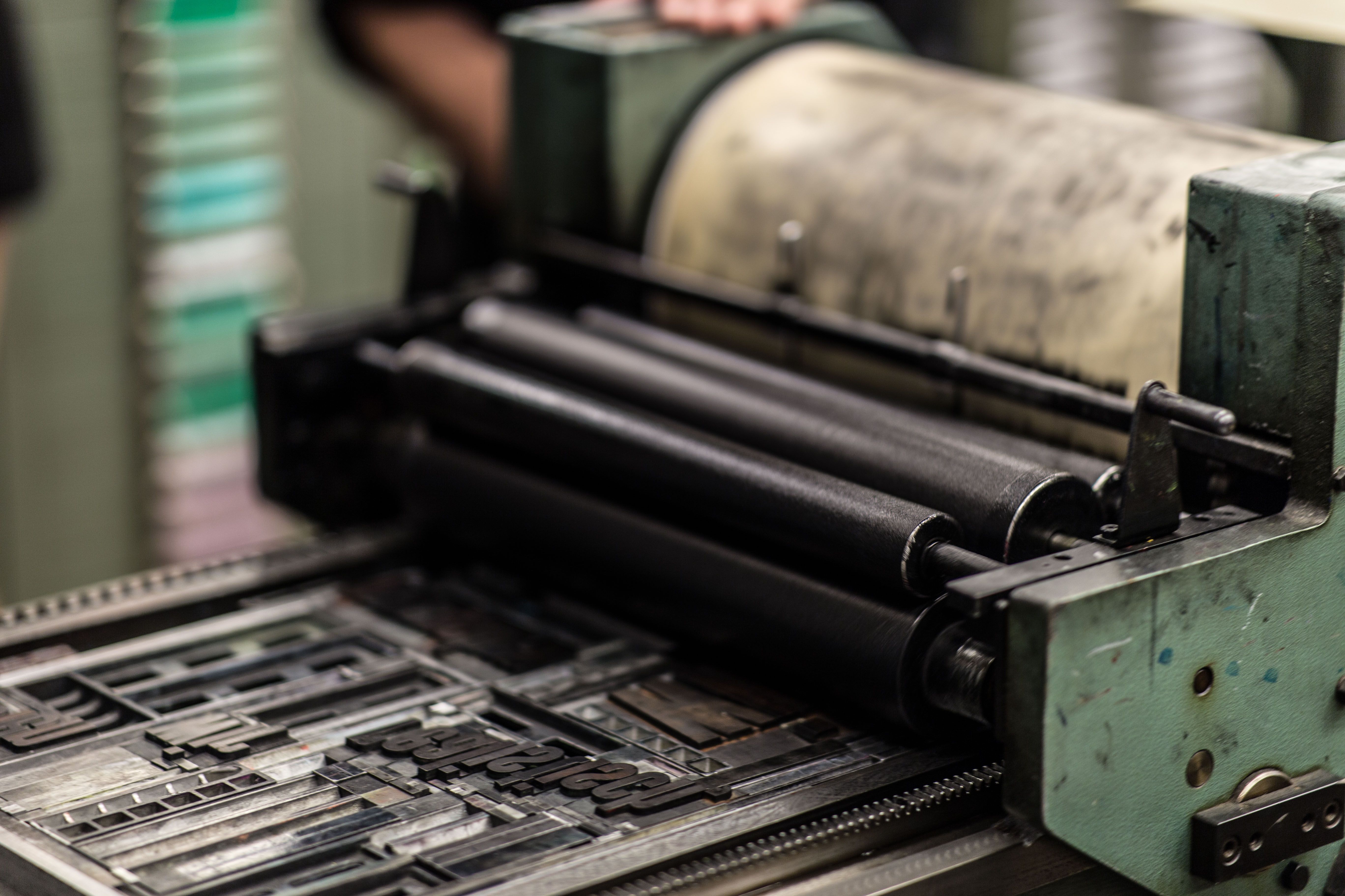
Make a compact brand sheet before the final files are prepared. It should include:
- Primary and secondary typefaces, with tested Polish characters such as ą, ć, ę, ł, ń, ó, ś, ź, and ż.
- A core palette with print values and digital values, rather than colour names alone.
- Rules for title, author, imprint, series, and endorsement text.
- One-colour and low-ink versions for stamps, bookmarks, invoices, and black-and-white listings.
- Image guidance: subject, crop, texture, contrast, and what should never appear.
- Export specifications for print, web, social media, and e-book platforms.
For Polish publishers, the metadata layer belongs in this system too. The National Library’s publisher guidance explains the role of ISBN, legal-deposit copies, and the CIP cataloguing programme. Those administrative details are not glamorous, but accurate title, author, edition, and imprint information make the book easier for booksellers, libraries, and search engines to identify. A beautiful cover with inconsistent metadata is still a discoverability problem.
Design for the thumbnail before the book fair
The cover has two lives. In one, it is a physical object with paper, height, width, texture, and a spine. In the other, it is a tiny rectangle competing with dozens of other rectangles.
Test the cover at three sizes: full print scale, a typical online listing, and a phone-sized thumbnail. At the smallest size, the title and author name should not merge into a grey block. If the image is the main hook, it should retain its basic silhouette. If the typography is the hook, remove visual noise until the words carry the weight.
This is also where a small press should resist a common temptation: designing for other designers. Readers do not reward a cover because its construction is clever. They reward it by stopping, understanding what sort of book it might be, and remembering it later.
The strongest test is not “Does everyone like it?” It is “Can the intended reader identify its invitation in two seconds?” A literary thriller and a collection of experimental essays do not need the same visual language, but both need an immediate reason to look again.
Turn one cover into a month of coherent marketing
Marketing becomes less exhausting when the cover supplies a reusable vocabulary. Extract three to five assets from it: a colour field, a type treatment, a crop, a texture, and perhaps one recurring graphic mark. Use these to create launch posts, author quotes, reading extracts, newsletter headers, event slides, bookmarks, and retailer graphics.
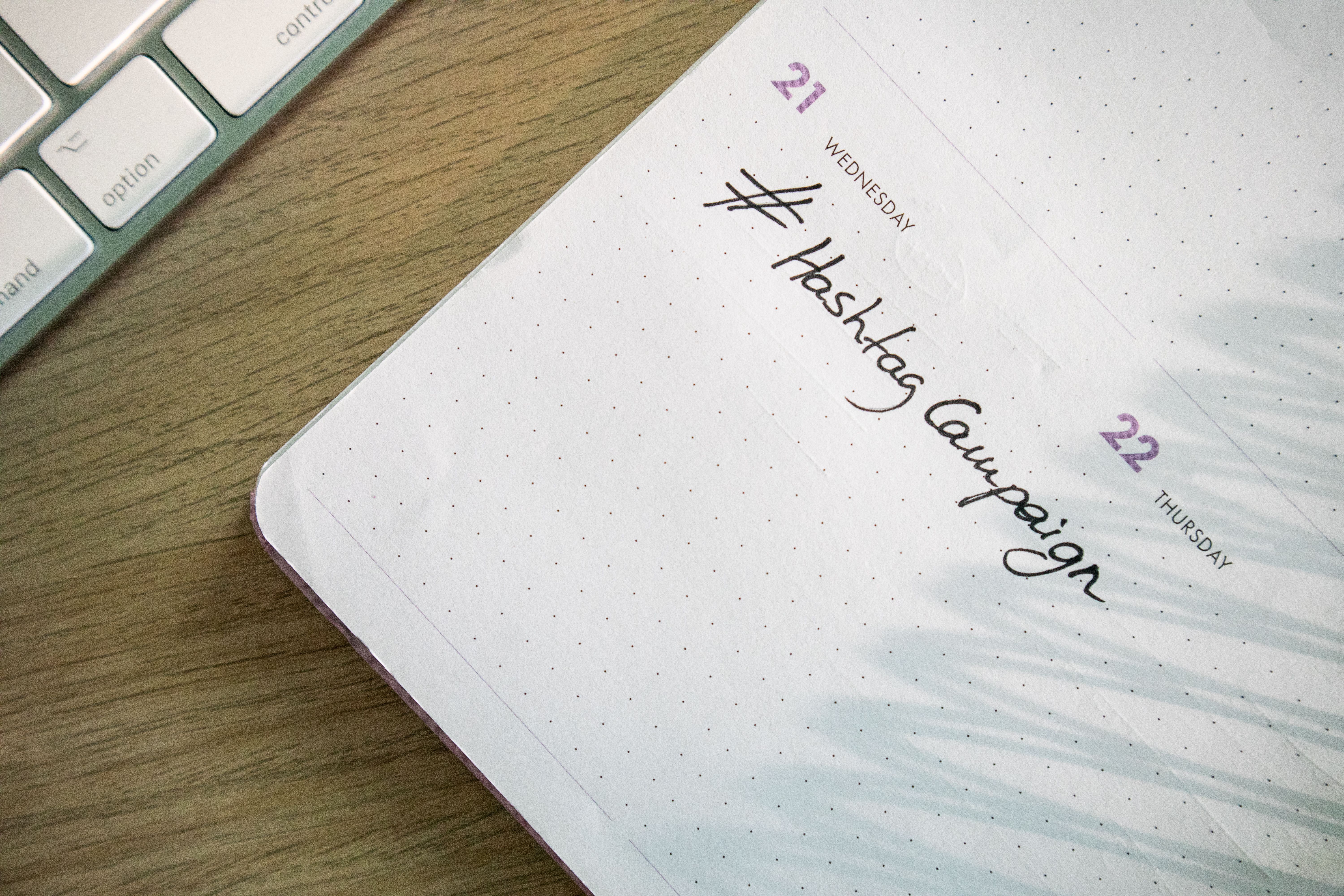
Keep the messages varied. One post can introduce the central question. Another can show the author discussing a source or influence. A third can explain the physical edition. A fourth can invite readers to an event. The design stays recognisable; the information does not repeat.
For paid or highly formatted promotional material, an advertisement maker can help a writer or small press adapt the same visual rules into multiple sizes without rebuilding every asset from the beginning. The tool is not the strategy. The strategy is deciding what must remain fixed: type hierarchy, colour relationships, logo or imprint treatment, and the book image.
Make templates for the formats you actually use, not every format available. A realistic starter set might be a square post, a vertical story, a newsletter banner, a quote card, and an event poster. Five reliable templates are more useful than twenty abandoned ones.
Accessibility is part of literary hospitality
Visual branding should invite people in rather than quietly exclude them. The W3C’s guidance for WCAG 2.2 recommends a minimum contrast ratio of 4.5:1 for ordinary text and 3:1 for large text. This is relevant to web pages, social graphics, event slides, and text placed over book photography.
Do not put small pale text over a detailed photograph just because the effect looks atmospheric. Add a solid or translucent field, simplify the background, or change the type colour. Do not communicate meaning through colour alone: “the blue quote card is the translation edition” fails for readers who cannot distinguish the colours.
Accessibility also improves marketing performance for everyone. Strong contrast, clear hierarchy, descriptive alternative text, and fewer words on a graphic help readers who are viewing it quickly, in bright light, on a small screen, or with sound turned off.
The book fair is a test of the whole identity
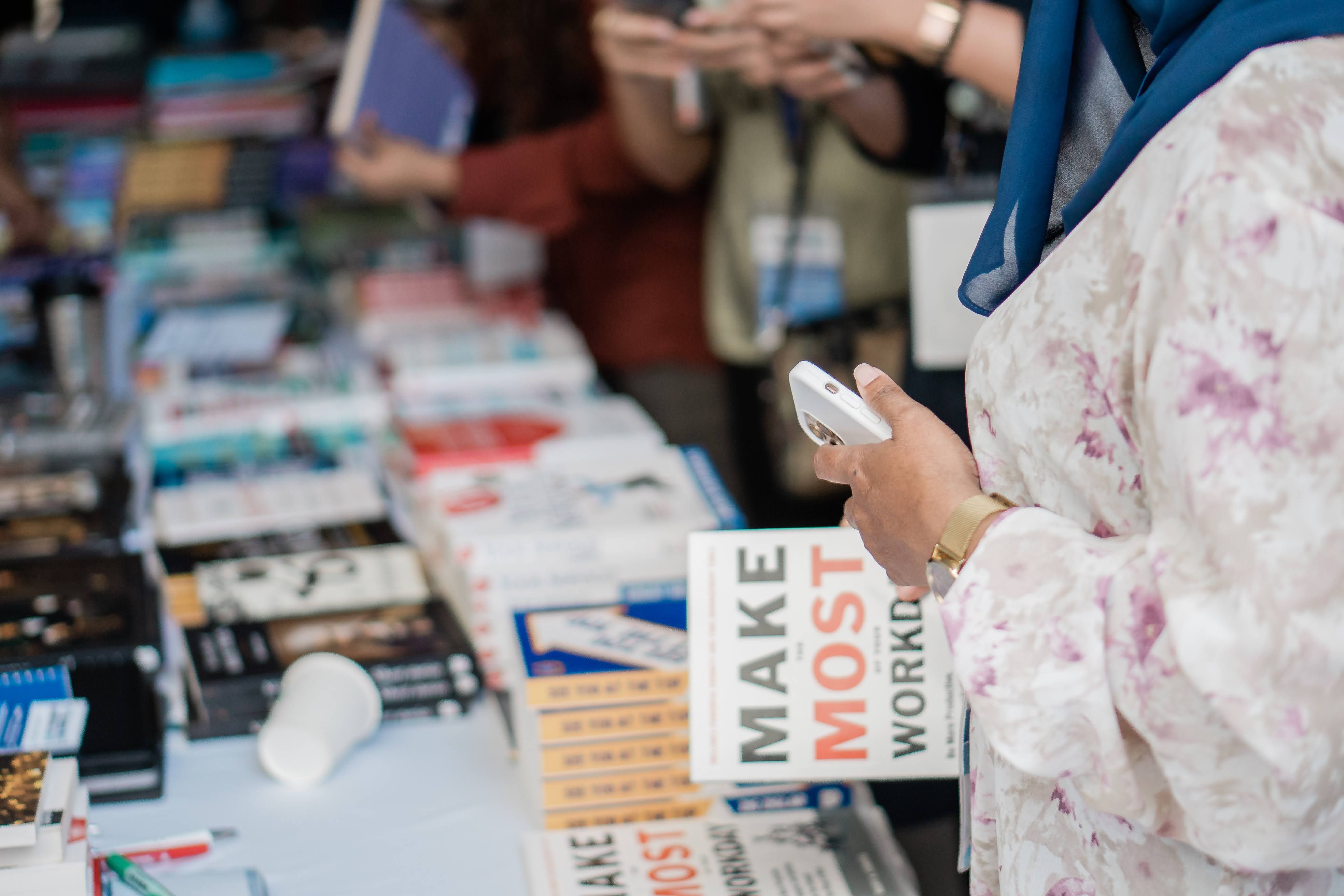
At a fair, readers may encounter the press before they encounter any single title. The table covering, vertical sign, staff badges, bookmarks, price cards, and book arrangement should make one clear statement. That does not mean making everything the same colour. It means giving the eye a path.
Place the newest or most important title where it can be seen from the aisle. Keep price and format information readable without a sales conversation. Give each book enough breathing room to be picked up. A crowded table communicates uncertainty, even when the catalogue is excellent.
The opposing view deserves a fair hearing: some writers worry that branding turns literature into a commodity and pressures authors to perform a marketable personality. That concern is real, especially in a sector where the 2025 Instytut Książki study involved 663 creators in its survey and 75 in qualitative interviews, and reported that only 25% of respondents lived solely from creative work. The pressure to become both author and full-time marketer is not imaginary.
My answer is to separate recognition from performance. A consistent cover system does not require an author to become an influencer, reveal private life, or flatten a difficult book into a slogan. It simply makes the work easier to find and identify. The writer can set the boundaries; the design can carry the continuity.
A practical launch checklist for writers and small presses
- Write the one-sentence reader promise before choosing the palette.
- Check the title and author name at thumbnail size.
- Test Polish diacritics in every chosen typeface and weight.
- Prepare print, digital, one-colour, and low-resolution versions.
- Make the cover, author portrait, excerpt cards, and event materials visibly related.
- Check text contrast and add meaningful alt text to online images.
- Confirm ISBN, imprint, edition, and metadata details before distribution.
- Photograph the actual printed book for at least some marketing assets; a flat digital mock-up cannot show paper, scale, or binding.
- Plan a small sequence of messages rather than repeating the launch announcement.
- Review the identity after the first event: what did readers ask, miss, or remember?
Frequently asked questions
Does every Polish author need a personal brand?
No. Every author needs a discoverable, credible presentation, but that can be modest. A consistent name treatment, portrait style, website, and book information may be enough. Personal branding should not require constant self-disclosure.
Should a small press use the same cover style for every book?
Usually not. Use a shared system rather than a repeated costume: consistent placement, typography, spine treatment, or imprint mark can connect a list while allowing each book to keep its own character.
What should come first, the cover or the marketing plan?
The cover and marketing plan should develop together, but the book’s promise comes first. Once the promise and audience are clear, the cover can generate a flexible set of assets instead of becoming a one-off image.
How much should an independent publisher spend on visual branding?
Spend first on the decisions readers will see repeatedly: cover hierarchy, typography, image direction, production accuracy, and a small set of reusable templates. A polished system with fewer assets is generally more valuable than a large volume of inconsistent graphics.
Can an author design their own book marketing?
Yes, particularly when the author works from a defined system and knows the limits of their tools. Get specialist help for typography, prepress, accessibility, or image licensing when those areas affect the book’s credibility or production safety.
The lasting advantage is recognisability
A manuscript earns attention through its writing. A visual identity earns the next glance, the remembered name, and the second encounter in a shop or feed. For Polish writers and small presses operating with limited budgets, that continuity is one of the few marketing advantages they can build once and use repeatedly.
The goal is not to make literature look more commercial. It is to make the work’s particular character visible before the reader has opened the first page.
How this article was put together
This guide combines practical design reasoning with current institutional sources checked in October 2026: the Polish Book Institute’s 2025 market report, the Instytut Książki’s report on working conditions for book creators, Biblioteka Narodowa’s publisher guidance, and W3C’s WCAG 2.2 contrast guidance. Market figures and survey findings are included only where those sources stated them. No claim is made here that a particular palette or template guarantees sales; branding improves recognition and consistency, while readership still depends on the book, distribution, relationships, timing, and sustained communication.